Carbon Credit Platform: A Marketplace Prototype, From Project to Buyer, in Two Weeks
A carbon credit is proof that a project, like protecting a forest or capturing methane, has kept carbon out of the air. Companies buy these credits to balance out their own emissions. This platform is where that whole journey happens: a project owner submits a project, an auditor checks it and decides how many credits it's worth, and the credits are then sold on a marketplace.
My client needed to show their stakeholders how this would work, so I designed it as a clickable Figma prototype. I had two weeks to turn a process most people have never seen into screens anyone could click through and understand.
My Role
Product Designer (UI/UX)
What I worked on
- Mapping the journey from project submission to a finished sale
- The project owner's side: dashboard, submission form and project statuses
- The auditor's side: review queue and credit allocation
- The three ways to list credits: QR codes, the marketplace and direct transfer
- The marketplace, project pages and live auctions
- A small design system, and the clickable prototype that ties it all together
Goals
The prototype had one job: make a complicated idea easy to follow.
That meant it had to
- Show the whole journey, from submitting a project to selling its credits
- Make each person's part clear: who submits, who checks, who buys
- Always show where a project is in the process
- Feel real enough to click through, not just a set of still pictures
- Be ready to present in two weeks
If a stakeholder could click through it once and explain it back, the prototype had done its job.
Background
Carbon credits are valuable, but the process behind them is hard to picture.
A project owner has a real environmental project and the data to back it up. An auditor needs to check that data and work out how many credits it's actually worth. Only then can the credits be sold, whether that's to companies browsing a marketplace, through QR codes attached to products, or straight to a buyer who's already lined up.
My client wanted all of this on one platform. Before building anything, they needed stakeholders to see how it would work, and that's what this prototype was for.
Problem
The hardest part wasn't any single screen. It was a process with three kinds of people, many steps and a lot of data.
I had to work out how to
- Make a long, data-heavy submission form feel manageable
- Show clearly where a project is: pending, in review, on hold, approved or rejected
- Help project owners fix problems when the auditor needs more information
- Give auditors what they need to decide how many credits a project is worth
- Connect the working screens with a marketplace that feels inviting to buyers
And all of it had to be ready in two weeks.
With two weeks, I couldn't design everything. I had to design what made the idea click.
The Flow
I started by putting the whole journey on one page, step by step, and giving each step an owner.
Giving every step one clear owner made the rest easier. Each screen only had to answer two questions: whose turn is it, and what happens next?
Submitting a Project
For project owners, everything starts from one overview.
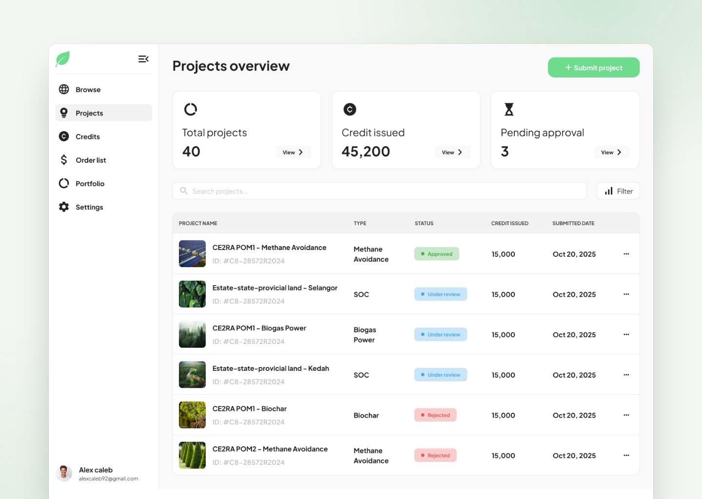
The dashboard opens on three numbers that matter most, total projects, credits issued and projects waiting for approval, with every project listed below it and a colored status beside each one. Submitting a new project is one obvious green button away.
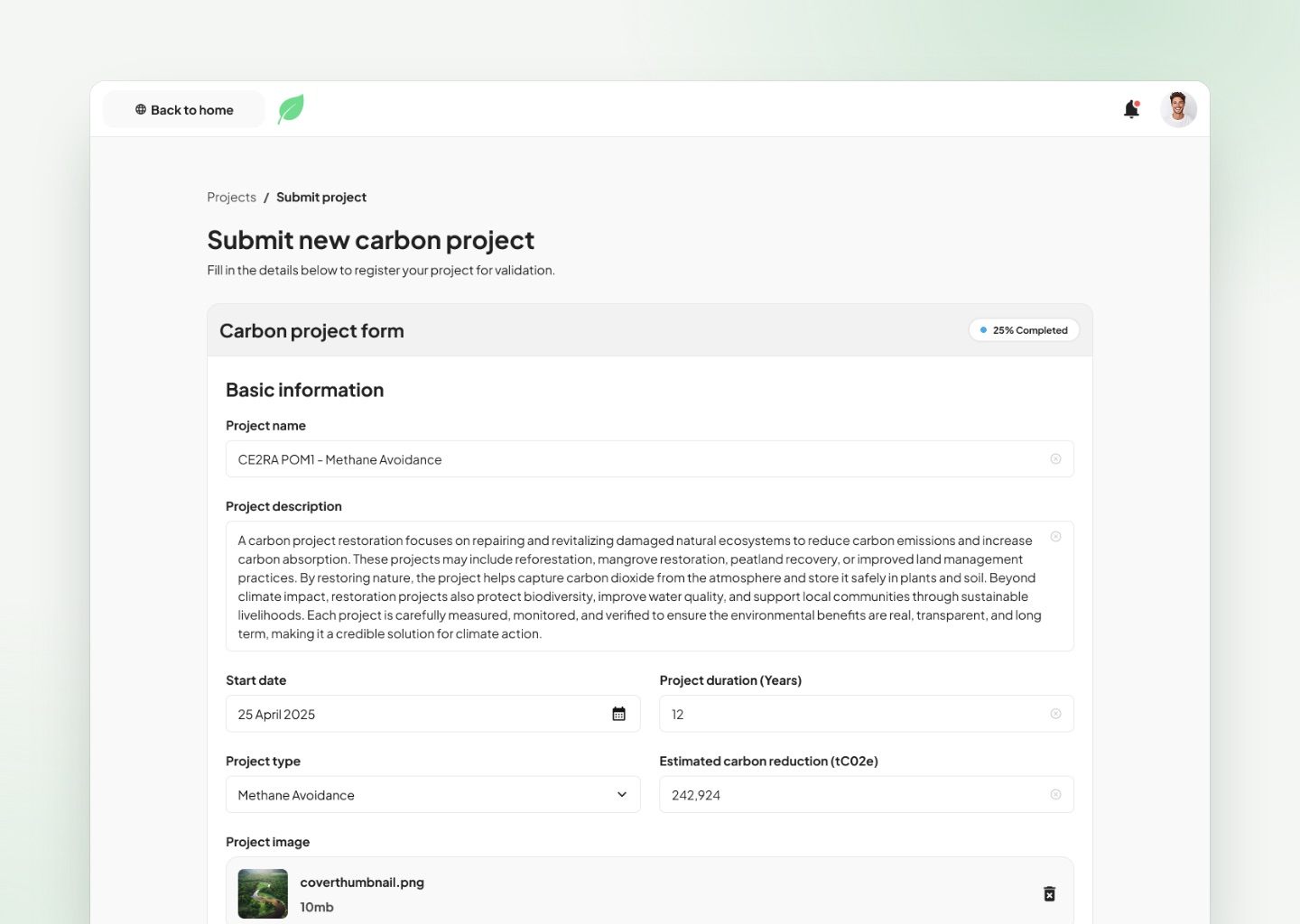
The submission form asks for a lot: project details, an estimated carbon reduction, a location with GPS coordinates and at least five supporting documents. I split it into clear sections and added a progress tag at the top, so it feels like a few small steps instead of one wall of fields.
A long form feels shorter when people can see how far they've come.
Always Knowing Where You Stand
A project can sit in review for a while, so its status had to be impossible to miss.
Every project page opens with a large colored banner that says exactly where things stand: pending, reviewing submission, additional information required, approved or not approved. Each one explains what it means and what happens next, in plain words.
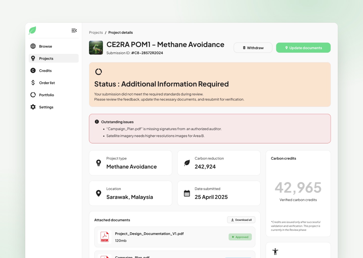
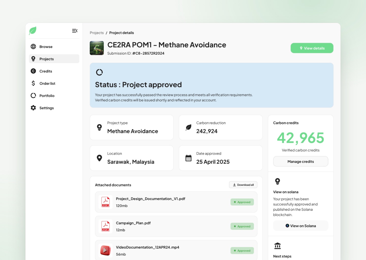
When an auditor needs more, the project owner doesn't have to guess what's missing. A discussion page lists the outstanding issues and turns each request into its own upload or field, with a way to message the auditor and resubmit once everything is in.
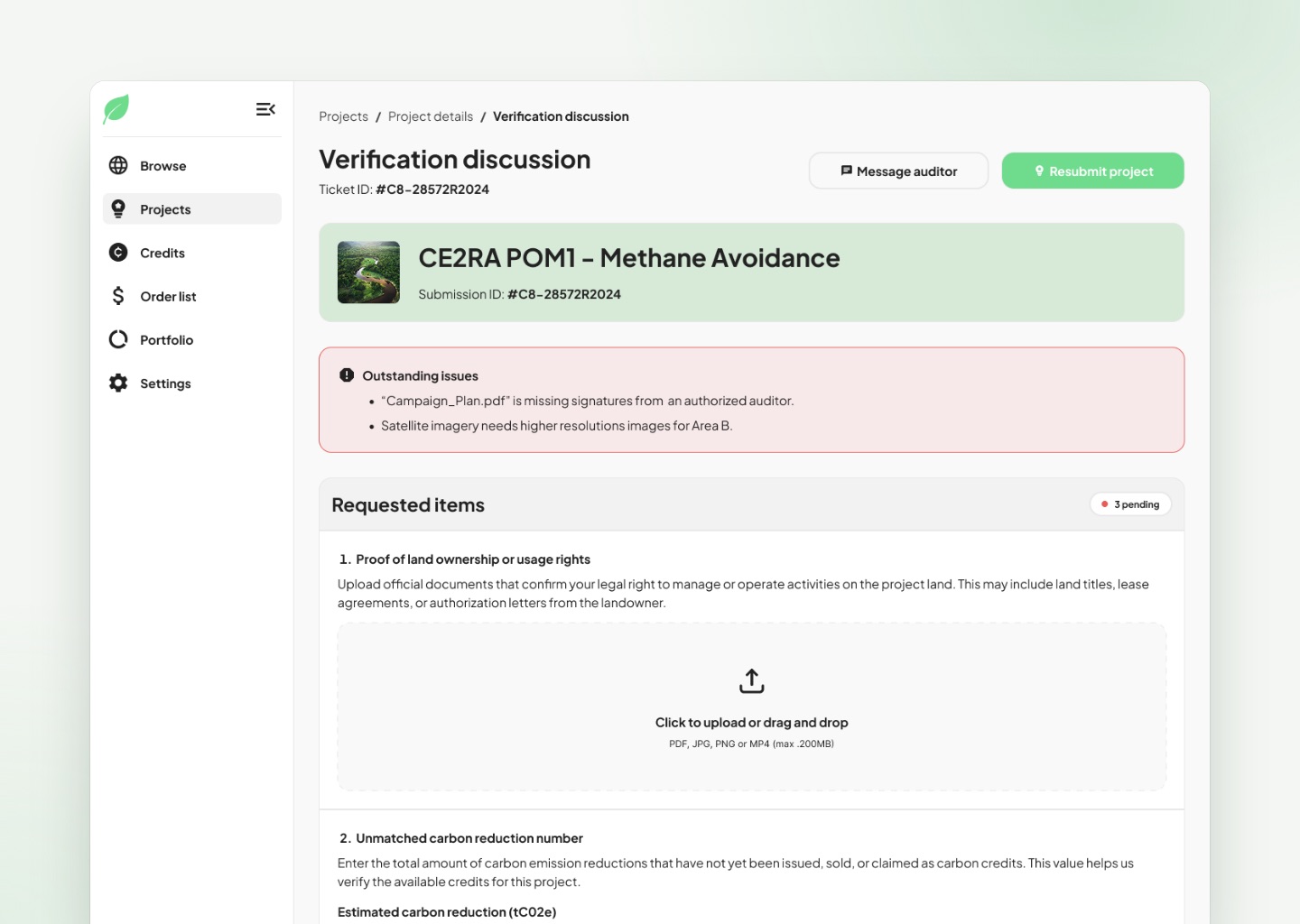
A rejection or a request for more information is only frustrating when it's vague. So I made every one specific.
Reviewing a Project
The auditor's side is built for working through a queue.
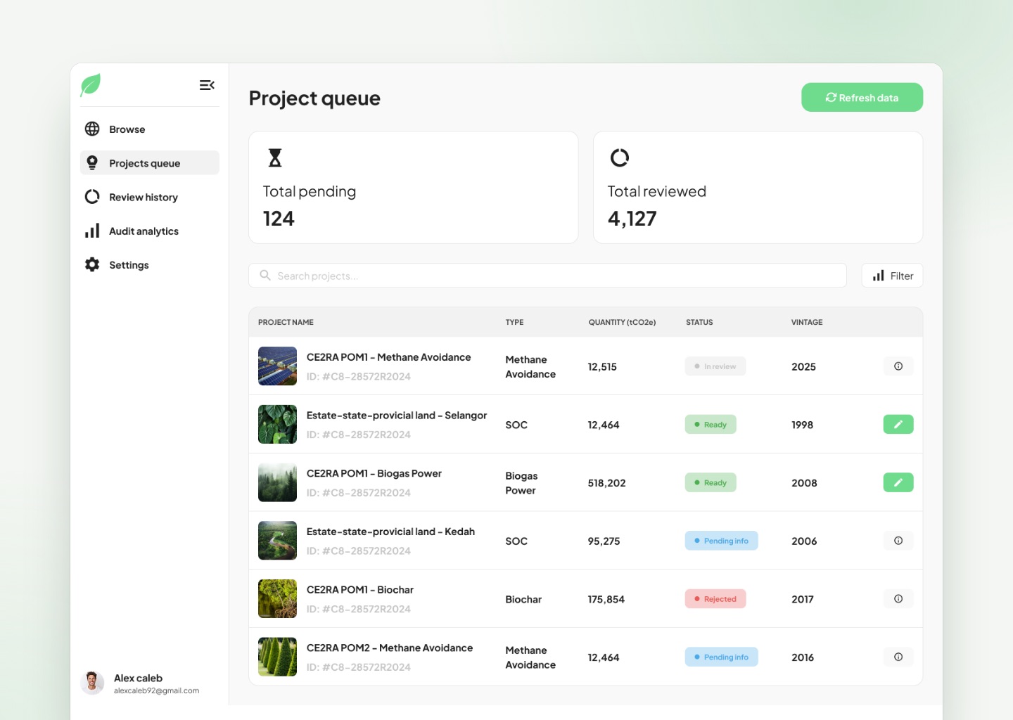
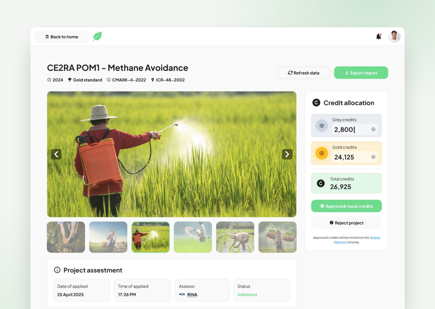
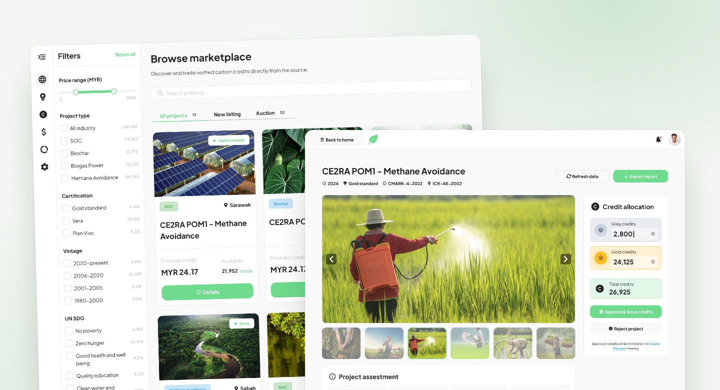
The project queue shows how many projects are pending and how many have been reviewed, with each project's status in the list. Opening one brings everything the auditor needs onto one page: photos from the site, the project assessment, and the measurement data behind the carbon calculation.
On the right, a credit allocation panel lets the auditor set the grey and gold credits, shows the total, and ends in two clear choices: approve and issue credits, or reject the project.
The decision sits right next to the evidence, so the auditor never has to jump between screens to make it.
Three Ways to Sell
Once credits are issued, the project owner decides how to sell them.
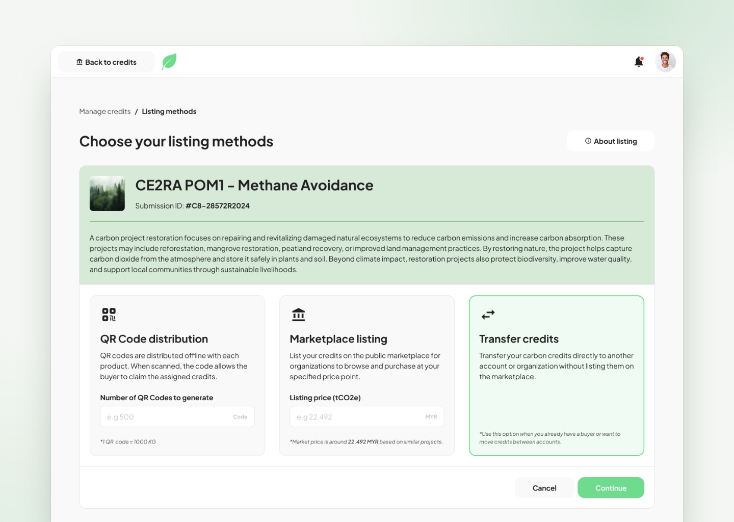
I designed three paths, shown side by side so they're easy to compare
- QR code distribution: generate codes to attach to products, so a buyer can scan one and claim the credits
- Marketplace listing: put the credits on the public marketplace at a chosen price, with a hint of the going market price
- Transfer credits: send credits straight to another account when a buyer is already lined up
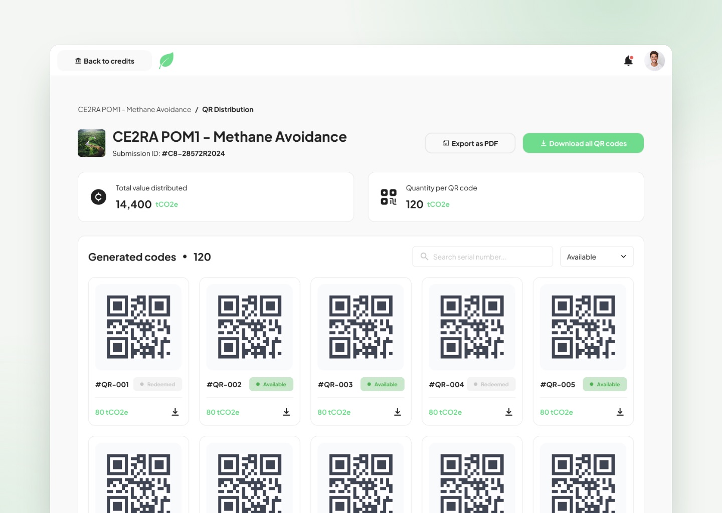
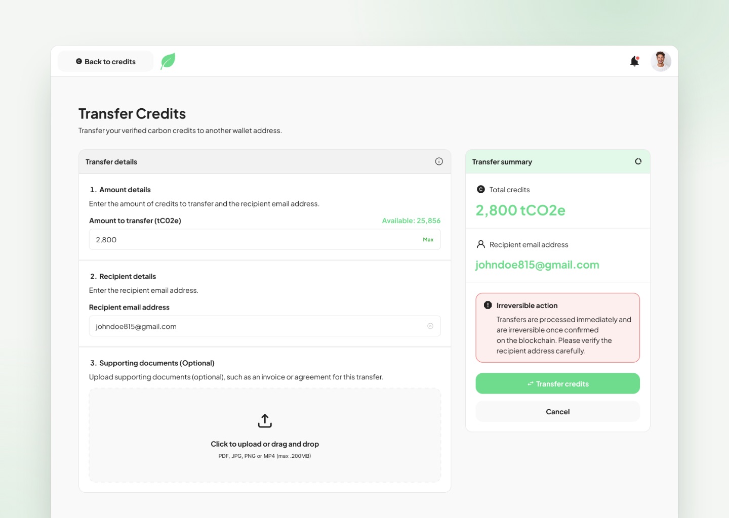
Each card explains when you'd choose it, so owners don't need to know the jargon to pick the right one.
The Marketplace
The working screens are about getting things done. The marketplace is about discovery.
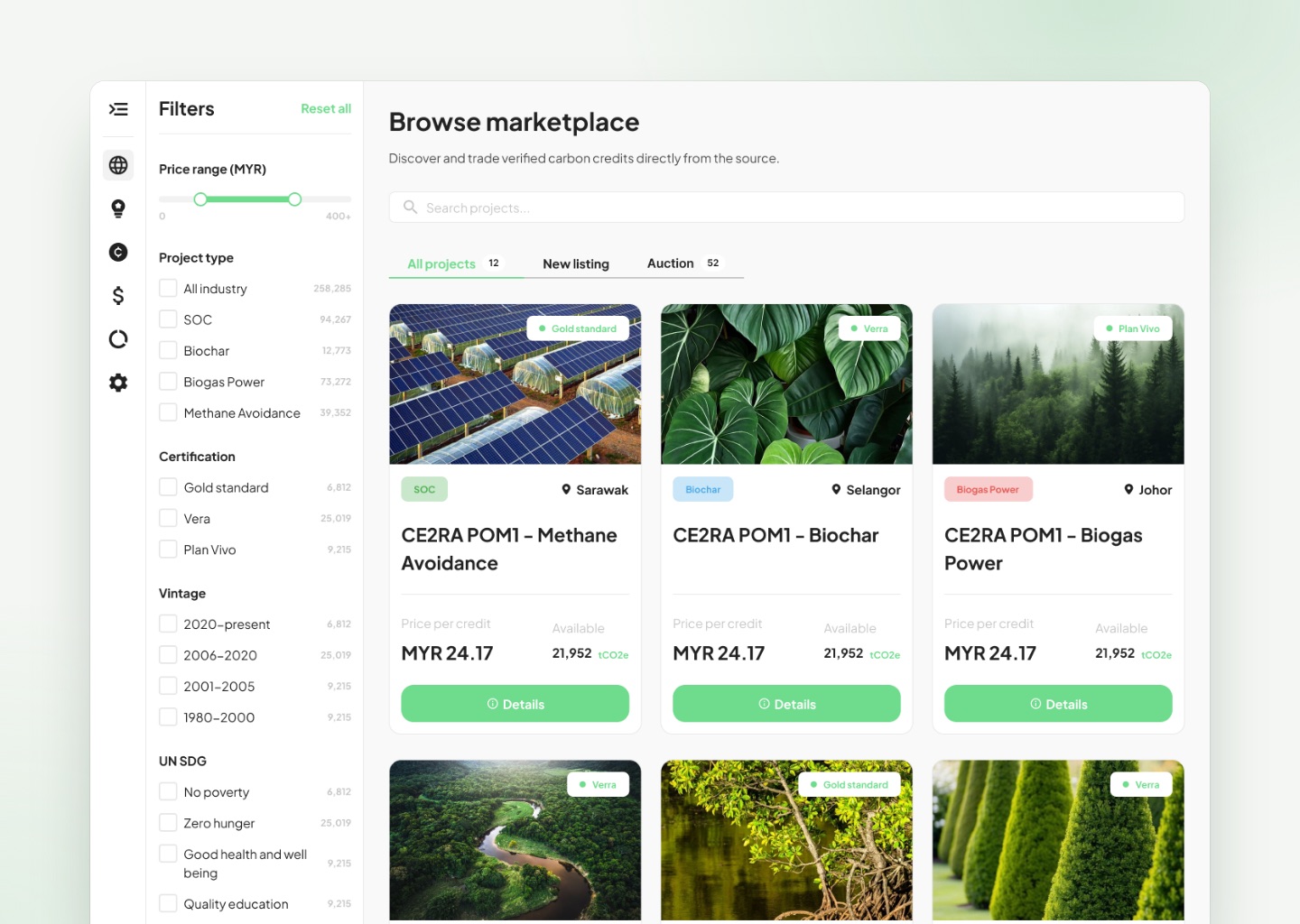
So it's more visual: every project leads with a photo, its type, location and certification, and the two numbers buyers care about, price per credit and how many are available. Filters on the left cover project type, certification, vintage, the UN goals a project supports and location.
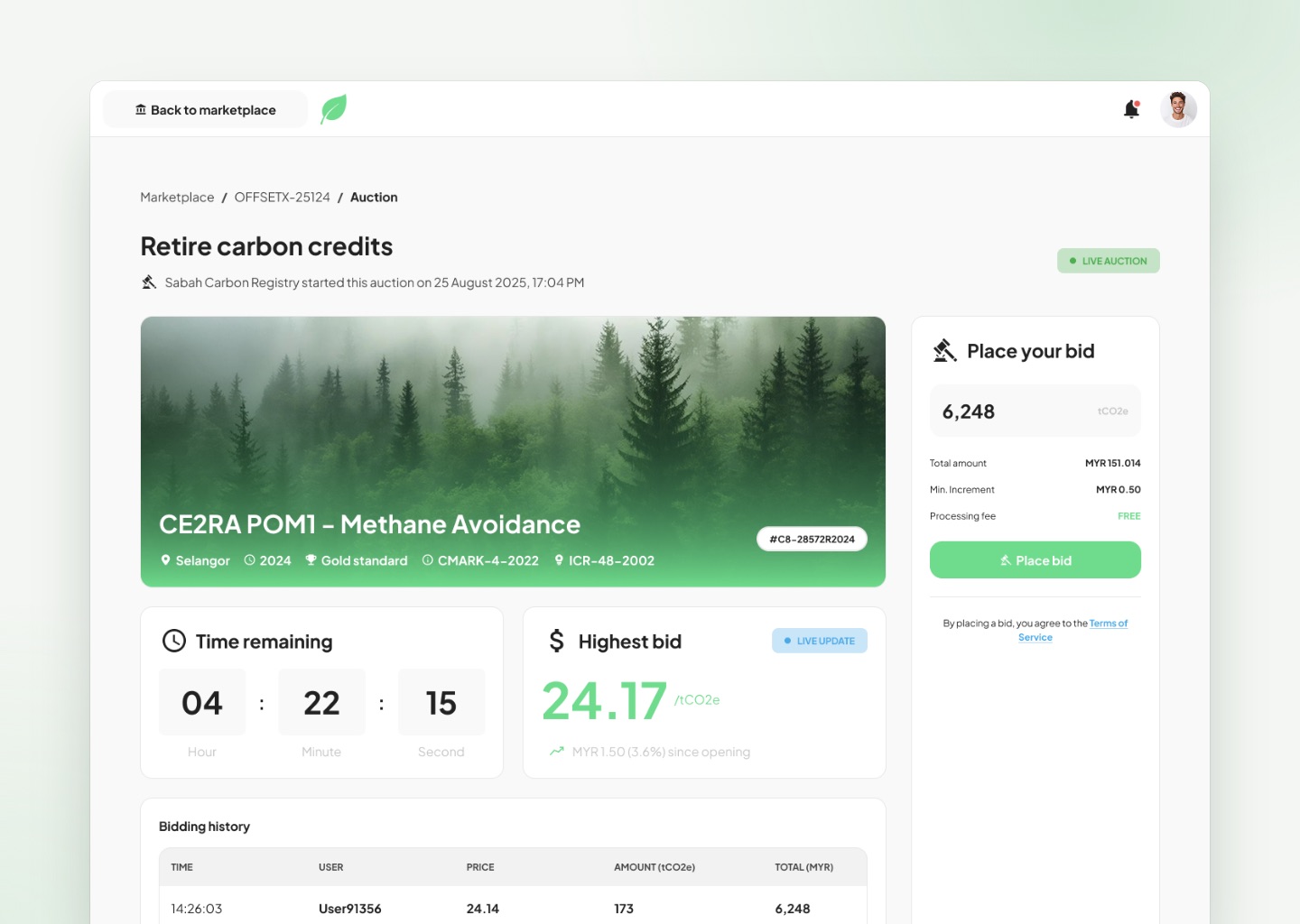
Some credits are sold through live auctions. The auction page shows a countdown, the highest bid updating live and the full bidding history, with the bid box always on the right.
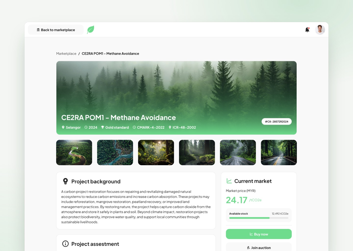
The marketplace tells the project's story first, then gives buyers the numbers to decide.
How I Worked
Two weeks meant I had to be deliberate about where my time went.
Two weeks. One complex workflow. A prototype built to get everyone on the same page.
Design System
With so little time, building the system first is what made two weeks possible.
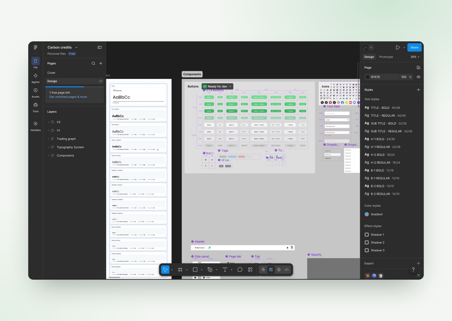
Before designing screens, I set up the pieces every screen would share. After that, each new screen was mostly a matter of putting existing parts together, which kept the whole platform consistent and quick to change.
This included
- A type scale in Plus Jakarta Sans, from page titles down to small labels
- Green primary and quiet secondary buttons, each with hover, pressed and disabled states
- Text fields with focus, filled and error states
- Status tags for Approved, Under review and Rejected
- Tabs with counters, a shared header and a side panel for moving around
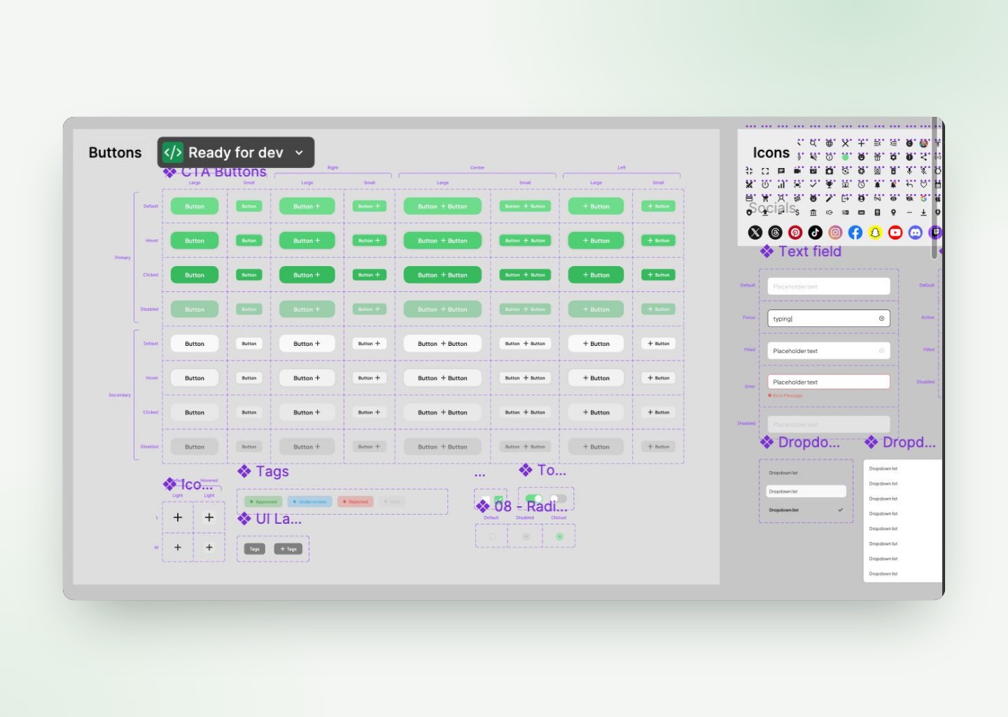
The status tags became the backbone of the prototype. Wherever a project appears, you can see where it is in the process.
Outcome
In two weeks, the idea became something stakeholders could click through.
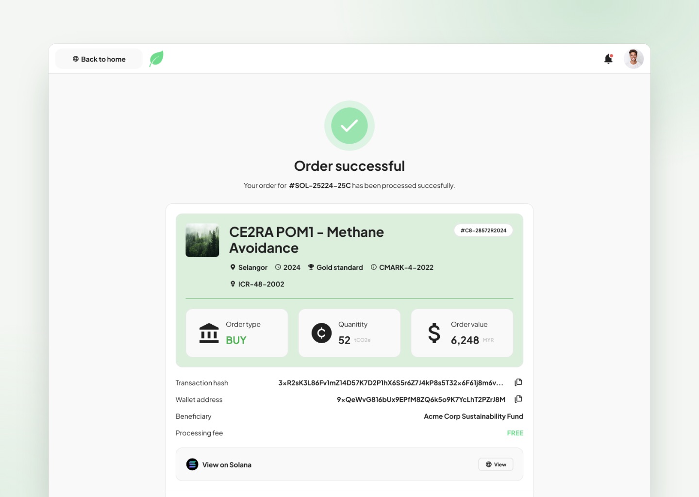
The prototype walks through the full journey: a project being submitted, reviewed and given its credits, then sold through QR codes, a transfer, the marketplace or a live auction. Instead of explaining the process in a document, my client could open the prototype and show it, which gave everyone the same picture to discuss and build on.
A prototype doesn't have to be finished to be useful. It has to make the idea easy to see.
Key Takeaways
This project taught me that when time is short, the most valuable thing a designer can do is decide what matters most.
Carbon credits were new to most of the people who would see this prototype. Putting the whole journey on one page, with one owner for every step, turned something abstract into a story anyone could follow.
It also showed me how much status design carries a workflow. Clear banners and tags, each with a plain explanation, did more to explain the process than any paragraph could.
And it confirmed that setting up the system first is what makes speed possible. With shared components in place, two weeks went into the flow, not into redrawing buttons.
What I took away
- Focusing on the main path under a tight deadline
- Turning a complex process into a simple story
- Using clear statuses to explain a workflow
- Balancing working screens with a visual marketplace
- Using a prototype to get everyone aligned